The Pill Club Rebrand
The Pill Club was a leading online birth control and delivery service that extended access for women’s reproductive health.
To reposition for growth, The Pill Club rebranded to Favor—introducing a master brand that clarified its mission, expanded beyond birth control, and differentiated it within a crowded category.
Developed in partnership with Character SF, I led the internal design team as Senior Design Manager to operationalize the brand—translating creative direction into a cohesive, scalable system across campaigns, lifecycle, social, and physical touchpoints. I defined core principles and governance, guiding implementation to ensure consistency, clarity, and differentiation at every patient touchpoint.
Client The Pill Club
Role Art Direction, Design, Production
Services Art Direction, Design System, Digital + Print Design, Motion, Packaging, Illustration
The Pill Club Team
Head of Brand Lauren Scrima
Designers Anneke Karreman, Elizabeth Capreol
Agency Character SF
Photography Viv Management
Existing Pill Club Branding + Applications

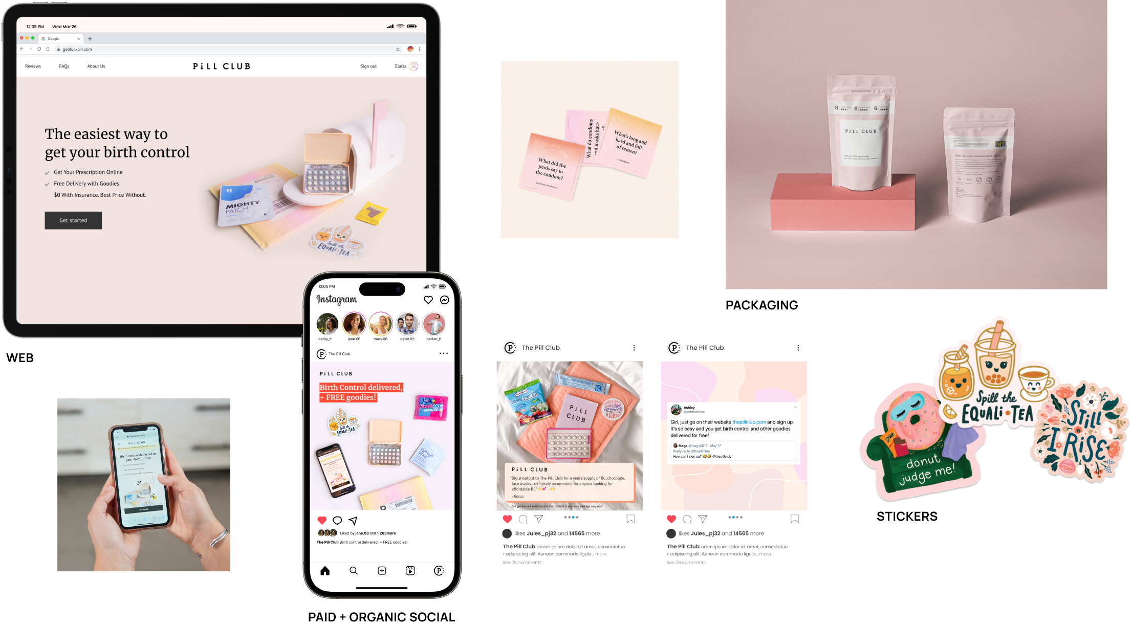
Direct Competitors
The Pill Club and its competitors—including Nurx, Twentyeight Health, Hims & Hers, and Pandia Health—independently converged on a nearly identical visual language. Pastel palettes, abstract shapes, soft gradients, and Instagram-style photography became category defaults, making these telehealth birth control brands largely indistinguishable at a glance.
Insight: Category convergence
Implication: Low brand recall, limited perceived differentiation
Design Principle: Build a bold, ownable system that departs from category tropes

INTRODUCING
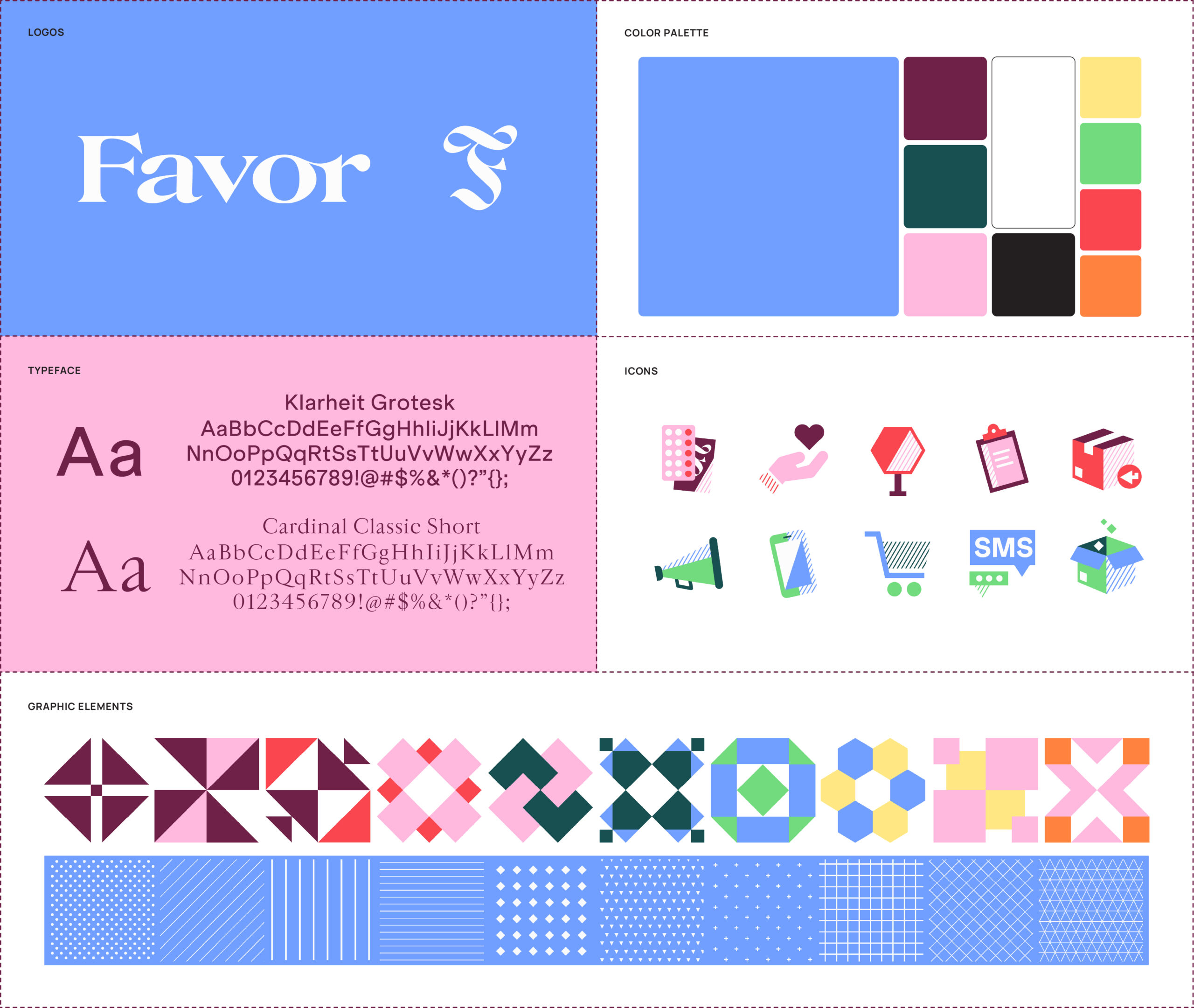
New Favor Master Brand
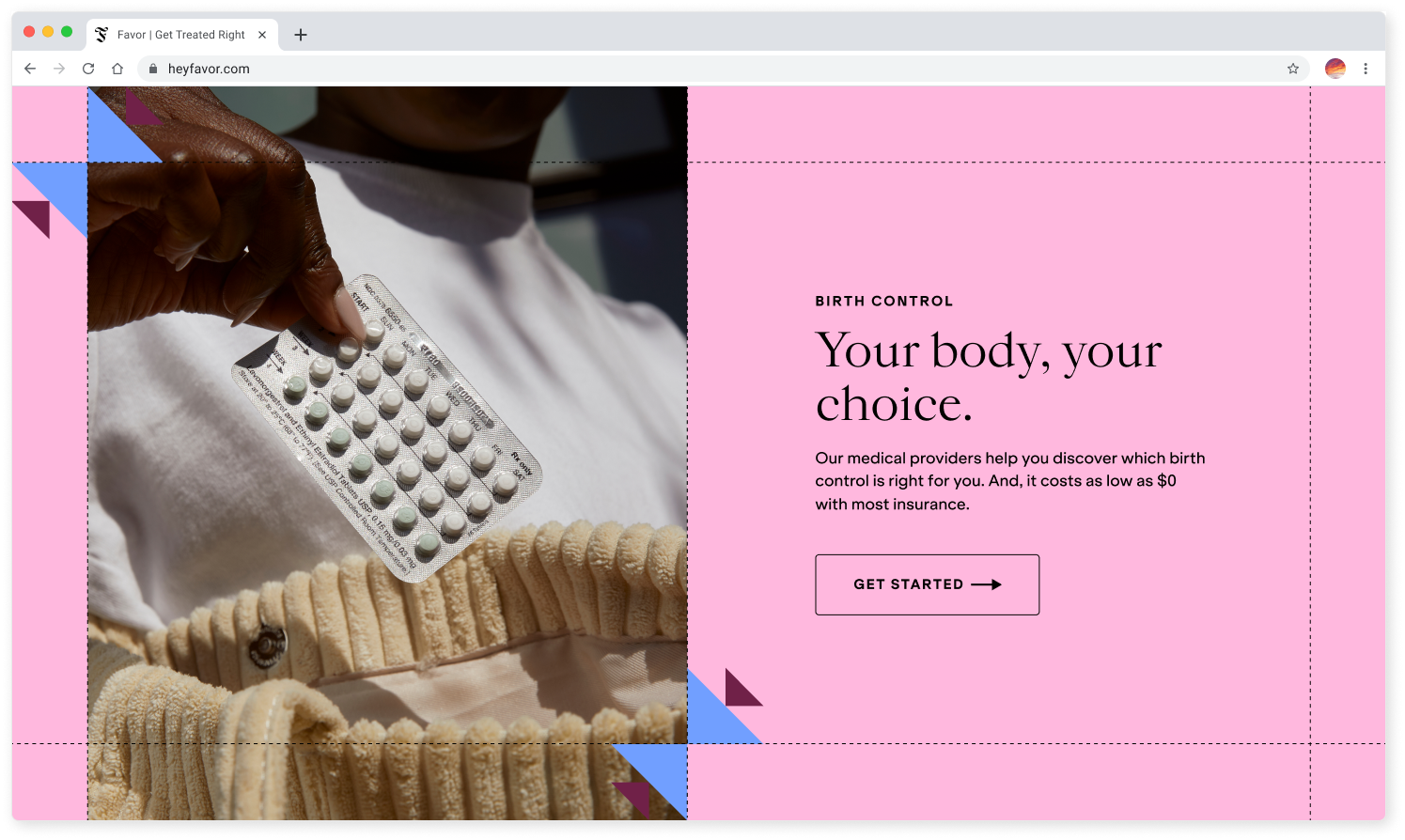
Breaking from the category’s reliance on pastels and “millennial pink,” Favor was built on a core insight: users want to feel heard and supported—not processed. The strategy centered on allyship, shifting away from transactional cues toward a brand that fosters trust, confidence, and connection.
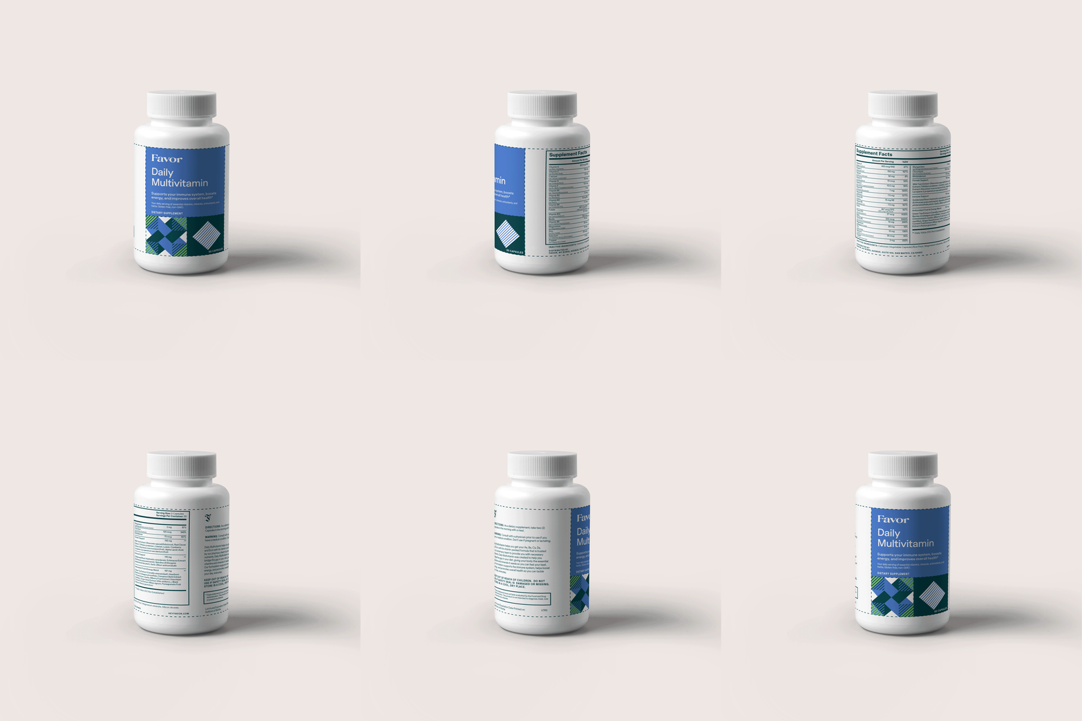
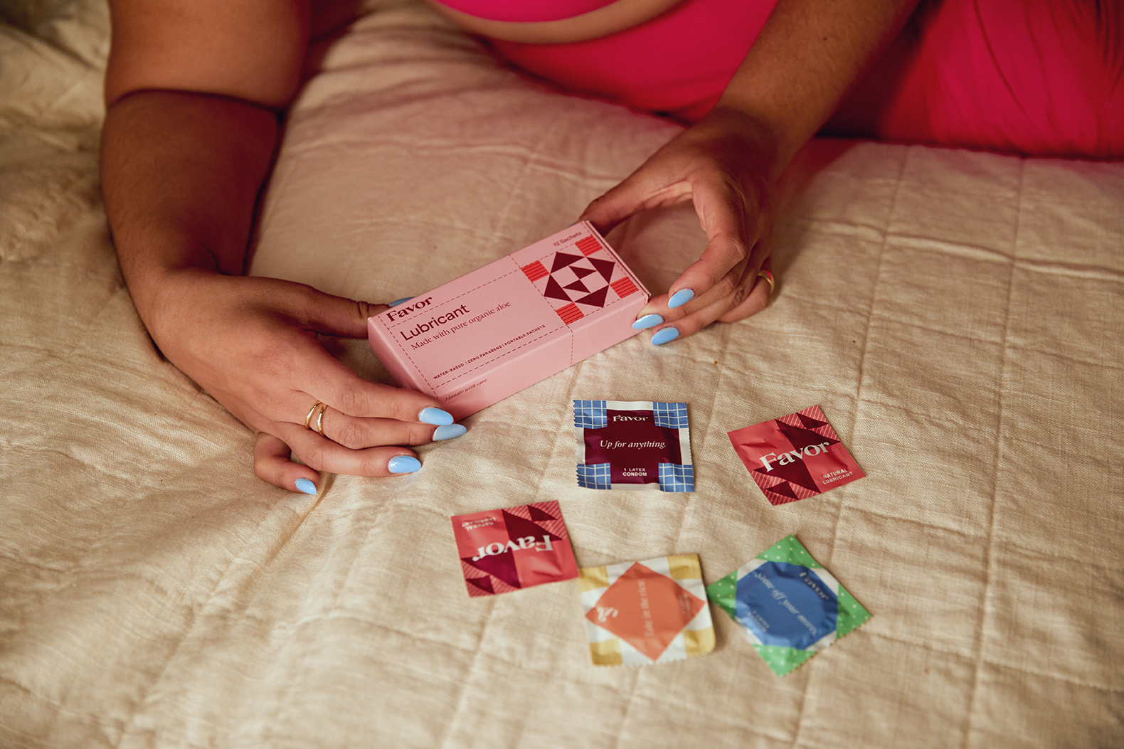
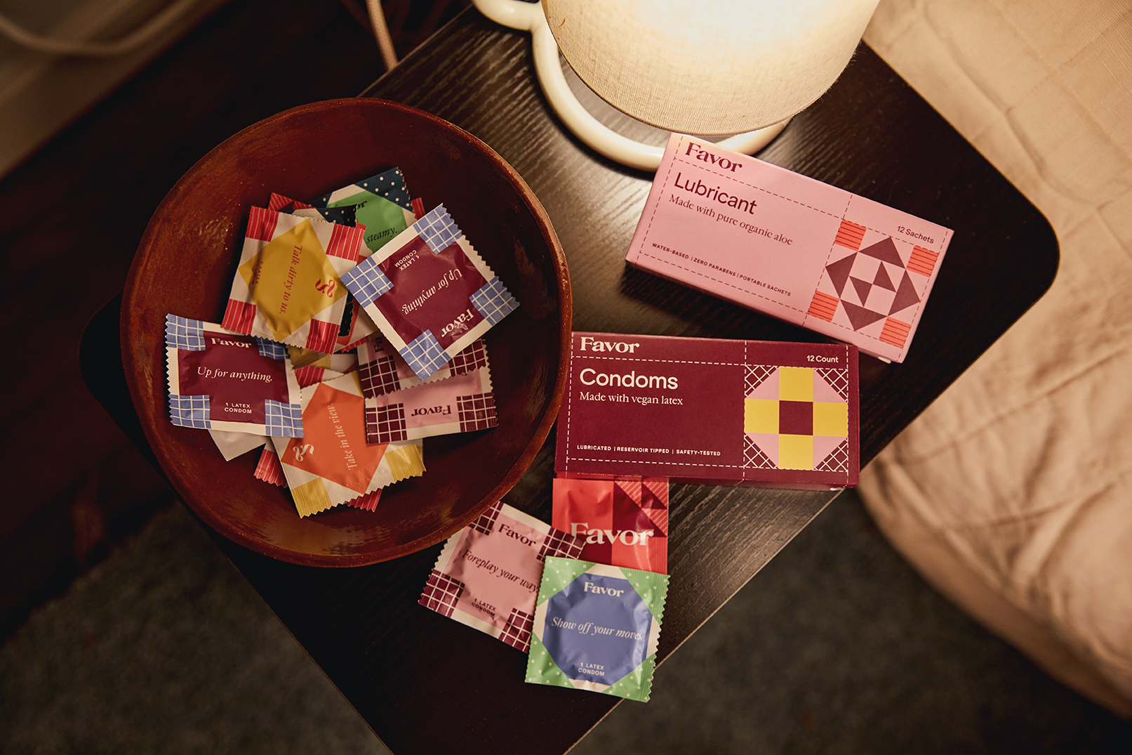
Inspired by quilting, the visual system uses modular, interchangeable elements that combine to reflect both shared and personal narratives, and express care as collective and lived. This approach informed a more expressive color palette and layered geometric forms—creating a distinctive, scalable system that maintains cohesion across campaigns, lifecycle, and product touchpoints.
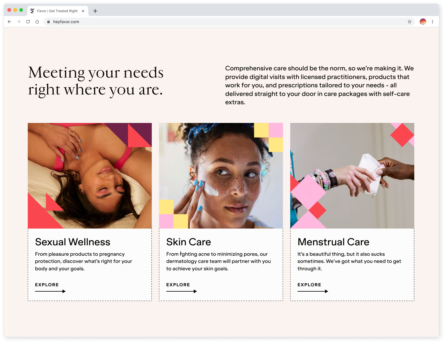
Favor Brand Applications

"Infuse healthcare with soul making those once left behind feel seen and supported in their wellbeing."
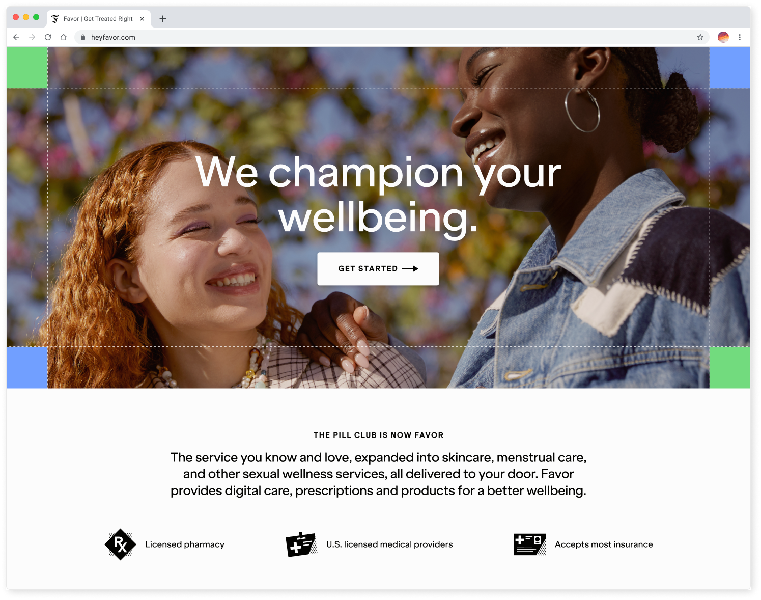
WEB
PACKAGING

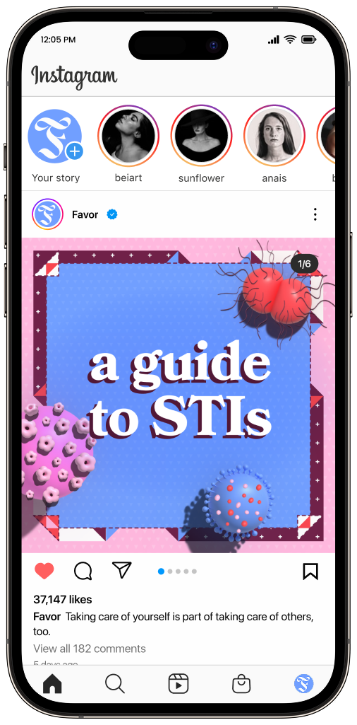
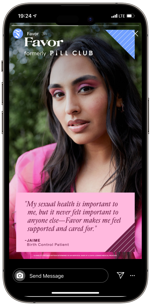
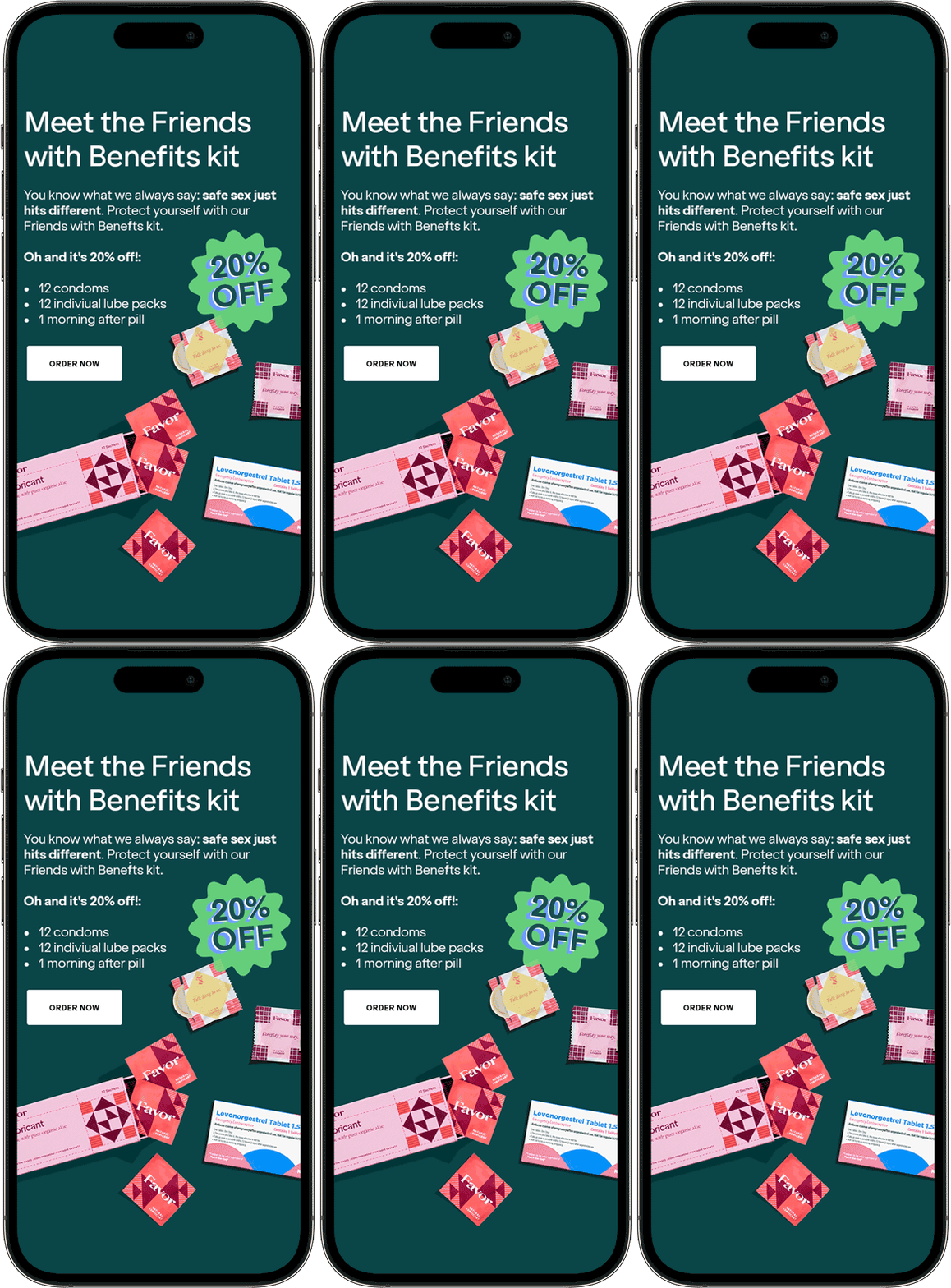
ORGANIC + PAID SOCIAL
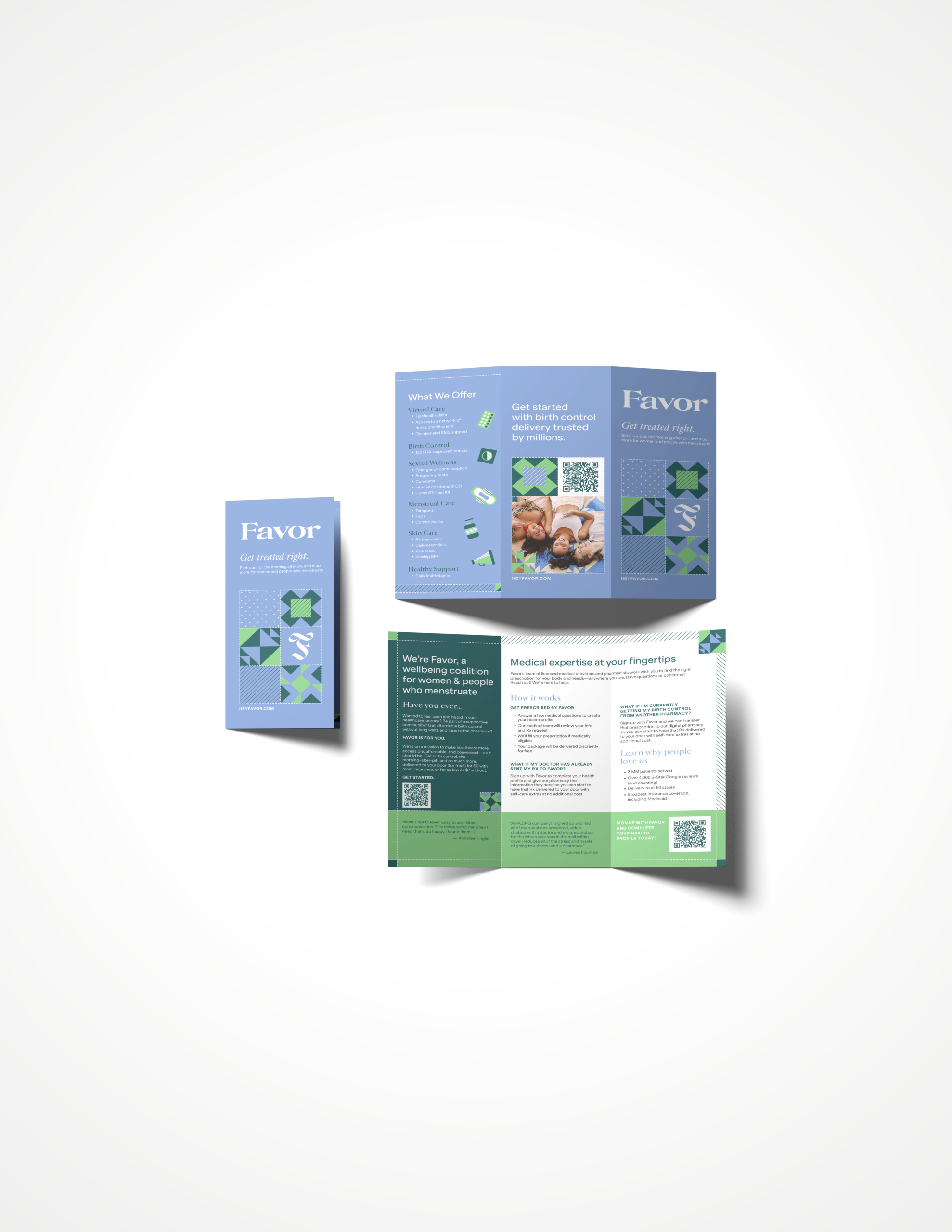
FAVOR B2B2C MARKETING KIT
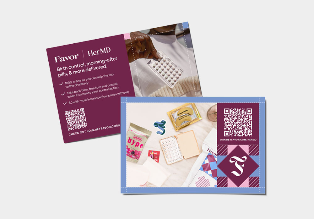
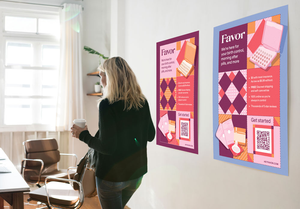
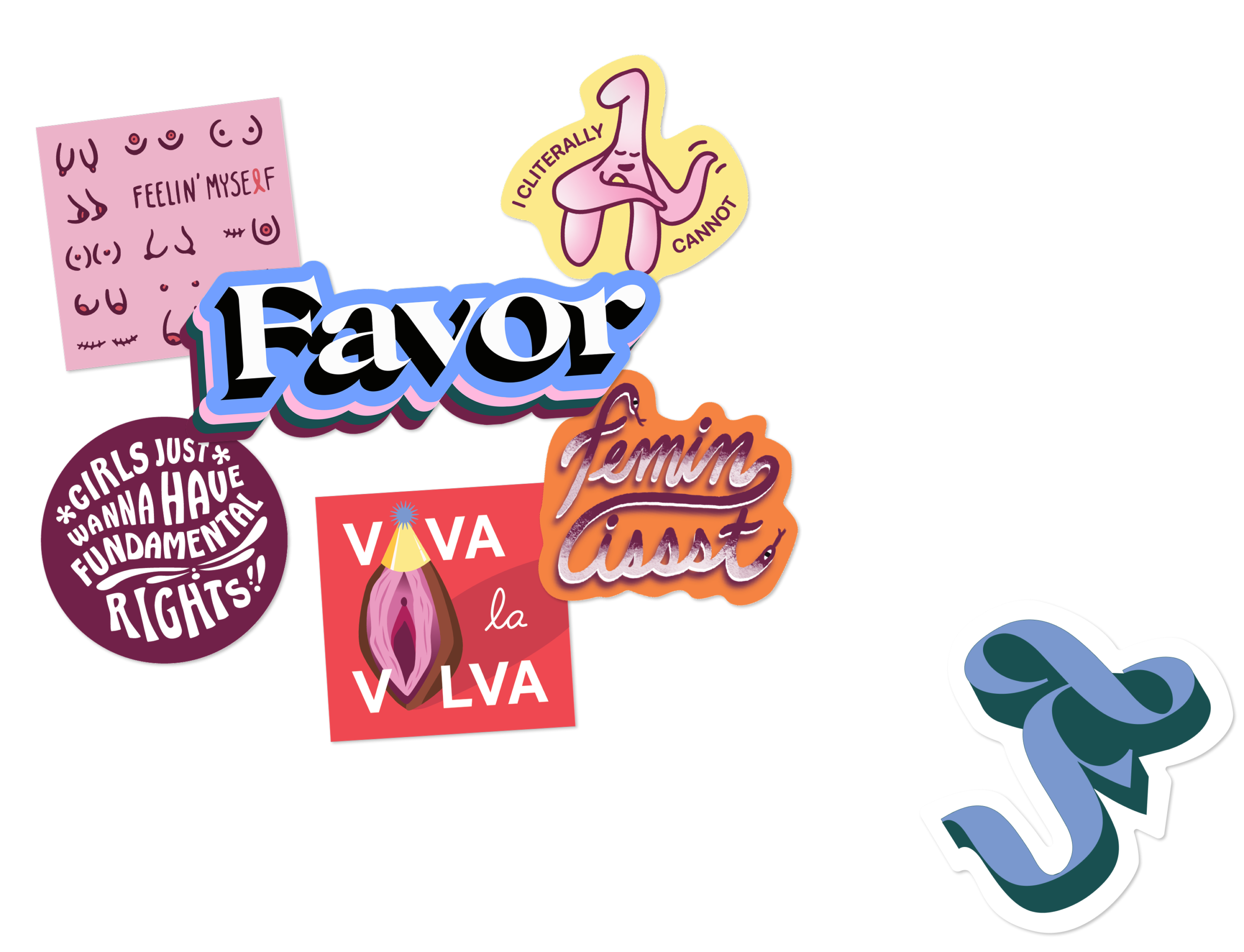
In partnership with various companies and campus health clinics, marketing collateral (postcards, posters, trifolds, and stickers) were distributed to raise awareness about the Favor brand.




LIFECYCLE MARKETING

Jill Concepcion is an art director and multidisciplinary designer connecting the dots between brand, design, and strategy.
© 2026 JILL CONCEPCION. ALL RIGHTS RESERVED.